Generative AI for Data Art & Visualization: Diffusion Model
Published: Jun 25, 2025

by Sylwia Nowakowska
DataArt
GenAI
Photography


NOTE: My first article on this artwork, 'Creating Data Art with GenAI: Diffusive Alpine Metamorphosis,' [1] was published in Nightingale, the journal of the Data Visualization Society. This blog post offers a more technical dive into the generative AI behind the piece and how it shaped its aesthetic.
Surrounded by Switzerland's natural beauty, I often find creative energy in its landscapes: towering peaks, glacial rivers, and tranquil alpine lakes. This data art project is a personal tribute to those moments of quiet awe and connection with nature. It weaves together three passions that shape my work: capturing the world’s beauty through photography, exploring the potential of AI in data-driven art, and crafting visual stories with code.
Generative power of AI: Diffusion models
Diffusion models [2], [3], [4] have quickly become a cornerstone of generative AI, powering state-of-the-art tools for image synthesis [5], [6], [7]. This makes them especially relevant for data artists seeking to merge datasets with creative visual output.
At a high level, pure diffusion models learn to generate images by reversing a process that gradually adds noise to real examples during training. As shown in Fig. 1, training a diffusion model involves two main phases [2], [8]:
Forward Diffusion Process (top row): Starting with real data (e.g., a photo or artwork), noise is incrementally added until the image becomes indistinguishable from pure noise. This process is entirely deterministic and doesn’t require learning—it’s just a way to simulate image degradation.
Reverse Diffusion Process (bottom row): The model, typically a neural network architecture like a U-Net, learns to reverse this noise step-by-step. Given a noisy image, it tries to predict and remove the noise, gradually reconstructing an image that resembles the original input. Over time, this process allows the model to generate entirely new, realistic images from random noise.
In essence, diffusion models don’t generate images all at once. Instead, they start from noise and refine it over many steps, mimicking a process of emergence. This approach lends itself beautifully to data-driven experimentation and expression. For a deeper dive into the distinctions between creating visuals for aesthetic appreciation versus analytical insight, consider exploring my post on Data Art vs. Data Visualization.

Figure 1) Training a pure Diffusion Model. Such a model synthesizes realistic images by learning to reverse a noise corruption process. In the forward phase, noise is systematically added to real data until it becomes indistinguishable from random noise. During generation, a denoising U-Net gradually refines pure noise into coherent images (Figure based on a diagram by Steins@Medium; robot image generated with Adobe Firefly).
Latent Diffusion Models [9] enhance efficiency by compressing images into a lower-dimensional latent space using an encoder (Figure 2, top-left). Instead of operating on full-resolution pixels, the diffusion process is applied to this compact representation, making training and generation faster and less resource-intensive. The decoder then reconstructs the final image from the denoised latent representation (Figure 2, bottom-left).
A key strength of diffusion models is their ability to be conditioned, i.e., guided toward generating specific outputs through external inputs such as text prompts or reference images. This enables outputs that are not just generative but responsive to human intention.
The most common form is text-to-image generation [10], where the model synthesizes visuals from a textual prompt. In this process, the model learns to align noisy image refinements with semantic concepts expressed in the prompt, such as "A robot working as a painter." The model progressively steers random noise toward a visual interpretation that fits the textual description. Another powerful approach is text-guided image-to-image generation [11], where the model is conditioned not only on text but also on an input image. Figure 2 (bottom row) shows that this dual-conditioning enables more controlled transformations.

Figure 2) Training a Conditioned Latent Diffusion Model. The real image is encoded into a latent representation where noise is progressively added (top row). The denoising U-Net learns to reverse this process while being guided by conditioning inputs: a text prompt or/and a reference image. After denoising, the latent is decoded into the generated image (bottom row). This approach enhances efficiency (via latent space) and creative control (via conditioning). Figure based on a diagram by Steins@Medium; images generated with Adobe Firefly.
Figure 3 demonstrates these two generative modes in action with a trained diffusion model. In the text-to-image generation (top row), the model begins with pure random noise and, guided solely by the prompt 'Swiss Matterhorn in a cubist artwork style,' iteratively refines this noise until a coherent image of the mountain emerges in the specified style. For text-guided image-to-image generation (bottom row), the model takes an initial photograph of the Matterhorn as input. The same prompt then directs the transformation: the original photograph is gradually reimagined through cubist textures and forms, retaining structural similarity while adopting the stylistic qualities from the prompt. This technique makes diffusion models exceptionally versatile for artistic workflows that blend real-world visuals with imagined aesthetics.

Figure 3) Conditional Image Generation with Diffusion Models: Text-to-image (top row) and text-guided image-to-image (bottom row) generation using a trained diffusion model. In the text-to-image mode, the model starts from pure noise and incrementally constructs an image aligned with the prompt. In the text-guided image-to-image setup, the model is conditioned on both the input photograph and the prompt, enabling stylistic transformation while preserving the underlying structure (Photograph by the author, images generated by diffusion model).
Data for Art & Visualization: The Photograph and its Metamorphosis
The foundation for this piece was a photograph I took of the Matterhorn from Schwarzsee, above Zermatt, in late autumn (Fig. 4). The mountain was covered in early snow and lit by sunlight. The scene’s stillness and the contrast between the snow and the rugged peaks made it a striking image and a fitting reference for this project.
The photograph served as the data, the seed, around which the diffusion model could create. Transforming the photo into a work of generative art speaks to a broader principle explored in Data Art vs Data Visualization: while data visualization prioritizes clarity and insight, data art aims for emotional resonance and subjective interpretation.

Figure 4) The photograph: Matterhorn viewed from Schwarzsee in late autumn (Photo by the author).
Using a diffusion model in text-guided image-to-image mode, I transformed the original photograph with the prompt:
“Artistic wavy version with subtle pink and violet tones.”
The model added noise to the image and then gradually removed it, allowing an artistic interpretation to emerge. To make this transformation feel alive, I captured 15 key denoising steps and inserted 30 interpolated frames between each pair. The result is a seamless, almost dreamlike progression from the original photograph to its AI-crafted version (Fig. 5, 6).
Figure 5) AI-driven metamorphosis: from the original photograph to its artistic reinterpretation.

Figure 6) AI-driven metamorphosis: the model's artistic reinterpretation of the photograph.
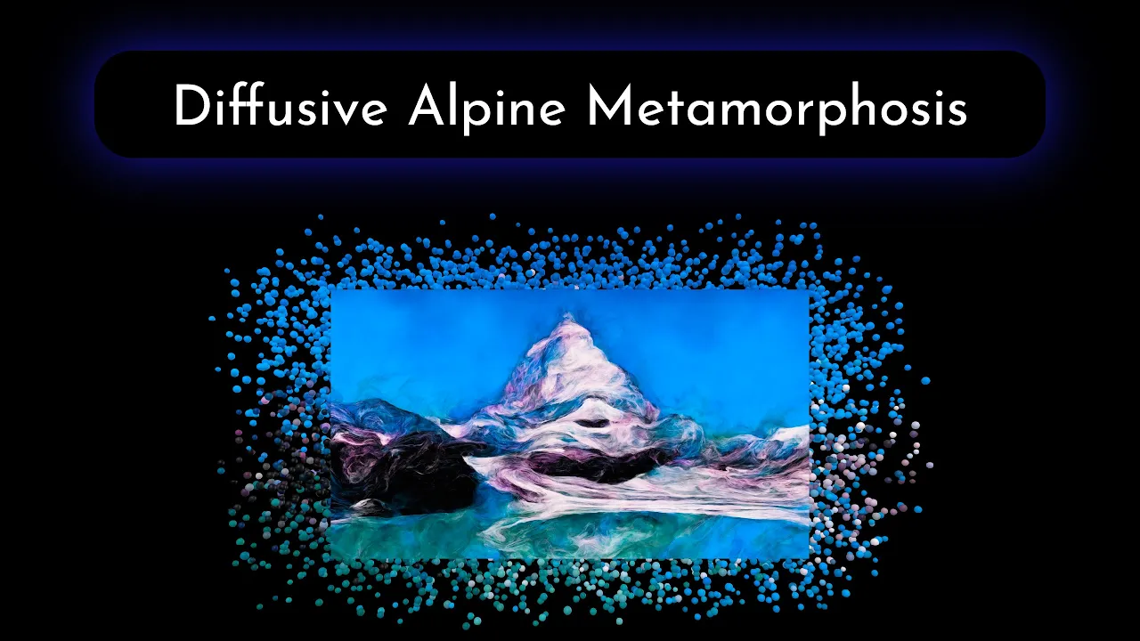
Diffusive Alpine Metamorphosis: A Data Art Tribute to Nature
Drawing on the concept of particle diffusion from my physics background, I created an animation to visualize the transformation of the Matterhorn photograph. The animation begins with the original photo and progresses through the series of the captured denoising sequence images, ending with the artistic reinterpretation. At each stage, the image disassembles into spheres that gently recolor as they move and then regroup to form the next image in the sequence. Figure 7 shows chosen frames from the first transition: from the original photography to the first captured image from the denoising sequence. I later added music to the animation to amplify the vibrant and energetic atmosphere: the Diffusive Alpine Metamorphosis data-driven artwork is available on YouTube. For the best experience, watch it on 4K.

Figure 7) Visual progression of the AI-driven metamorphosis: from the original alpine photograph to the first AI-generated transformation, marking the start of the denoising sequence.
Final Reflection: Convergence of Data, AI, and Human Imagination
This piece began with a single photograph, a structured array of color values capturing a fleeting alpine moment. The diffusion model transformed the data: noise was algorithmically introduced and then removed, guided by a text prompt, yielding new visual interpretations shaped by probabilistic learning. The final artwork became a collaboration between nature, machine, and human creativity, blending the serenity of the original landscape with the generative power of AI and a personal artistic vision expressed through photography, prompt design, code, and music.
‘Diffusive Alpine Metamorphosis’ reflects the intersection of technology, nature, and personal expression. It’s one of the artworks in my Data Immersion series, where I continually explore how data can be turned into art that resonates with emotion and meaning. If you're curious about how machine learning and creative code can turn raw data into immersive art, check out my earlier posts:
If this artwork resonates with you, consider subscribing: future pieces await, born from data and shaped by the quiet collaboration of code and imagination.


Author Bio
Sylwia Nowakowska is a physicist with a Ph.D. in Nanoscience. She has more than 12 years of experience in Research & Development, spanning Physics, Material Science, and Artificial Intelligence. Sylwia has always found joy crafting aesthetic data visualizations, whether for summarizing experiments, presentations, or academic publications. She finds it incredibly satisfying to see complex information become clear and accessible, meaningful, and beautifully represented. This passion led her to found Data Immersion, a platform where she shares her enthusiasm for Data Art & Visualization. When she's not immersed in data, you can find her immersed in water, enjoying swimming, or in the beauty of Swiss mountains, which she captures through her lens.
My Story | Visual CV | LinkedIn | Google Scholar | GitHub
S. Nowakowska, “Creating Data Art with GenAI: Diffusive Alpine Metamorphosis.”
J. Sohl-Dickstein, E. A. Weiss, N. Maheswaranathan, and S. Ganguli, “Deep Unsupervised Learning using Nonequilibrium Thermodynamics,” Nov. 18, 2015, arXiv: arXiv:1503.03585.
J. Ho, A. Jain, and P. Abbeel, “Denoising Diffusion Probabilistic Models,” Dec. 16, 2020, arXiv: arXiv:2006.11239.
A. Nichol and P. Dhariwal, “Improved Denoising Diffusion Probabilistic Models,” Feb. 18, 2021, arXiv: arXiv:2102.09672.
“Introducing Stable Diffusion 3.5,” Stability AI. Accessed: Jun. 06, 2025.
“Imagen,” Google DeepMind. Accessed: Jun. 06, 2025.
“Image generation - OpenAI API.” Accessed: Jun. 06, 2025.
“Hands-On Machine Learning with Scikit-Learn, Keras, and TensorFlow, 2nd Edition[Book].” Accessed: Mar. 17, 2025.
R. Rombach, A. Blattmann, D. Lorenz, P. Esser, and B. Ommer, “High-Resolution Image Synthesis with Latent Diffusion Models,” Apr. 13, 2022, arXiv: arXiv:2112.10752.
“Text-to-image,” Hugging Face. Accessed: Jun. 06, 2025.
“Image-to-image,” Hugging Face. Accessed: Jun. 06, 2025.
